Crossfields: Home
—
Crossfields was a series of publications intended to use the creative arts to stimulate conversation and provoke debate. Designers, illustrators, photographers, artists and writers were asked to explore topical issues through their work.
The potential of the idea was obvious and quickly artists, printers and paper suppliers had got on board and were offering their work and services for free so as they could be part of the project.
The second edition invited submissions of work on the theme of ‘Home’.
Homelessness, physical ownership of space, comfort, family, reassurance and social status were all explored.
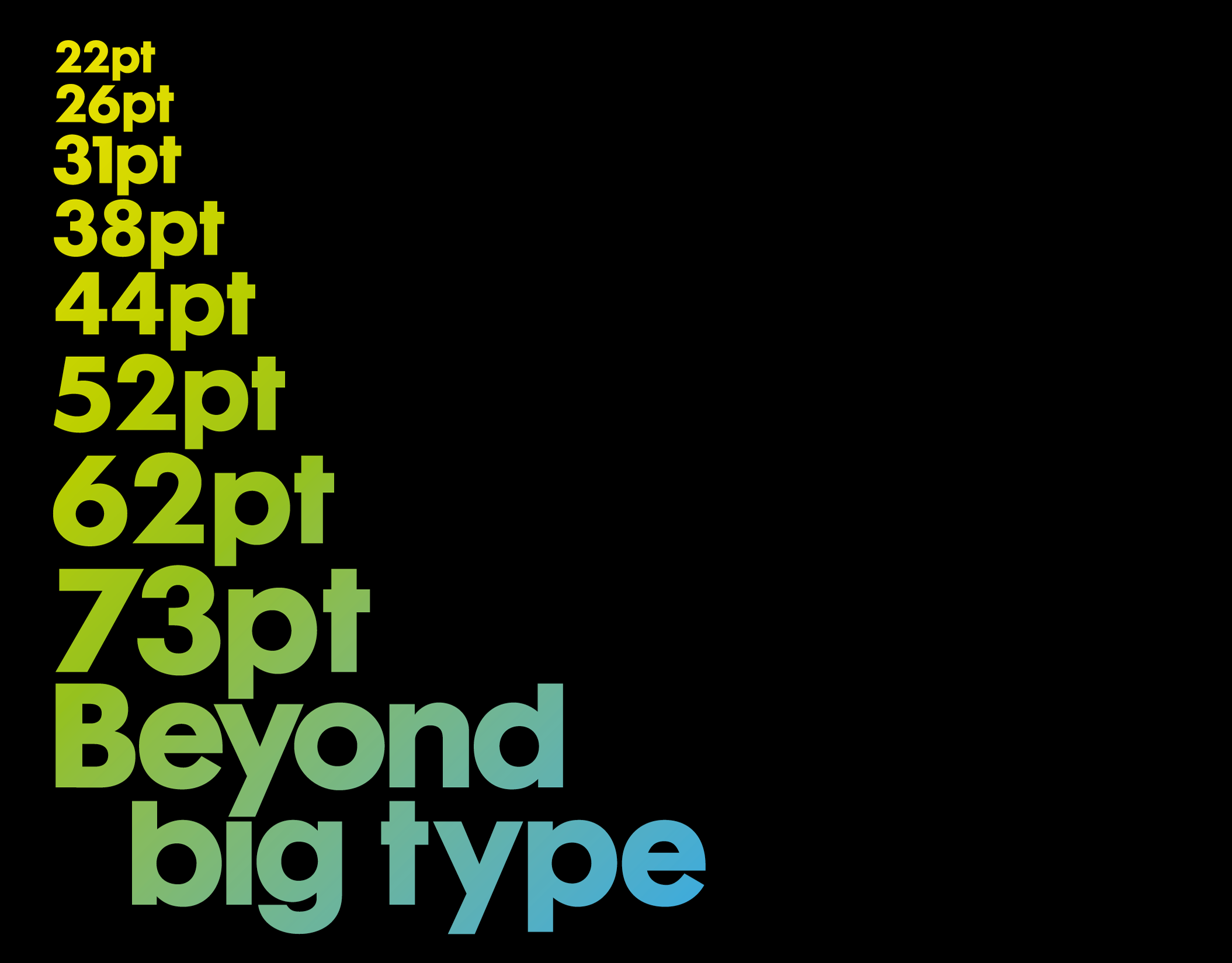
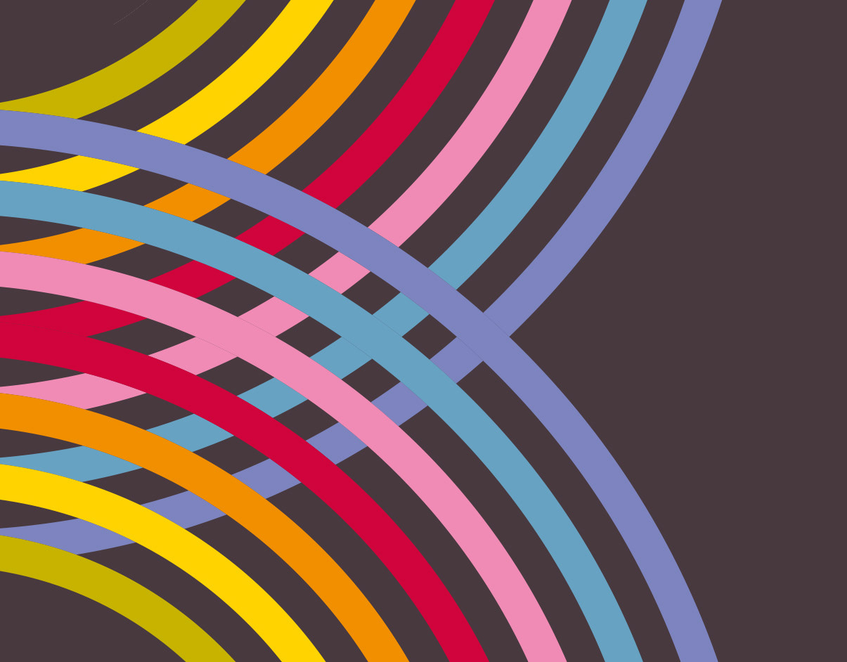
The book’s design attempts to make a house out of a book, the front cover-door being followed by bespoke wallpaper-endpapers. To compliment the fine art contributions a bespoke typeface – Apollo House – was created, based on Adrian Frutiger’s original.
“Excellent thought provoking and
beautifully designed publication.”
—
Eye Magazine,
Issue 63
beautifully designed publication.”
—
Eye Magazine,
Issue 63
